Rolex Explorer: Everest, Caves, and the Cleanest Tool-Watch Idea
A connected history of the Rolex Explorer and Explorer II, from the Everest-era Oyster Perpetuals and early 6350/6610 references to the long-running 1016, the modern 14270 and 114270, the 39 mm and revived 36 mm Explorer, and the orange-hand Explorer II built for darkness.
The Explorer story begins with Rolex's Everest association. After the 1953 ascent by Edmund Hillary and Tenzing Norgay, Rolex turned its high-altitude Oyster experience into a model identity: legible, robust, and stripped to essentials.
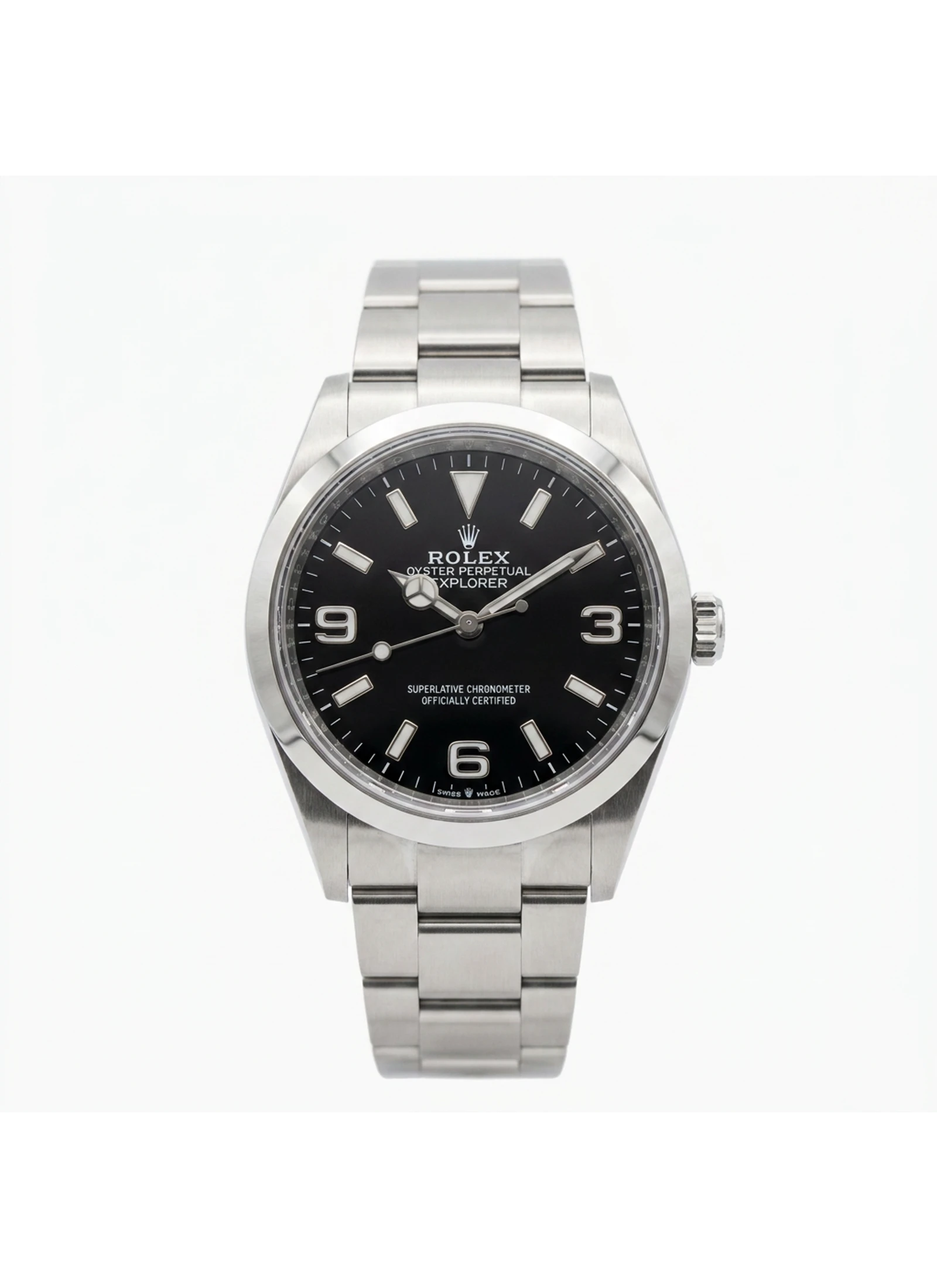
Early Explorer references made the watch's language clear: a steel Oyster case, black dial, large luminous triangle, and the 3-6-9 numerals that would become the Explorer's most recognizable shorthand. The design worked because it looked purposeful without looking specialized.
Reference 1016 turned the Explorer into a long-running archetype. Its 36 mm no-date case and simple dial made the watch feel equally at home in an expedition story and in everyday life. It is the Explorer reduced to the strongest possible sentence.
The Explorer II changed the mission. Introduced in 1971, it added a fixed 24-hour bezel and a bold 24-hour hand so explorers working without normal day-night cues could orient themselves. The 1655 made the branch distinctive; the 16550 made it cleaner and closer to the later Explorer II formula.
The 14270 modernized the Explorer without changing its silhouette: sapphire crystal, glossy dial, applied surrounds, and a sharper modern Rolex finish. The 114270 kept the 36 mm idea alive into the 2000s, proving the model did not need size or complication to stay current.
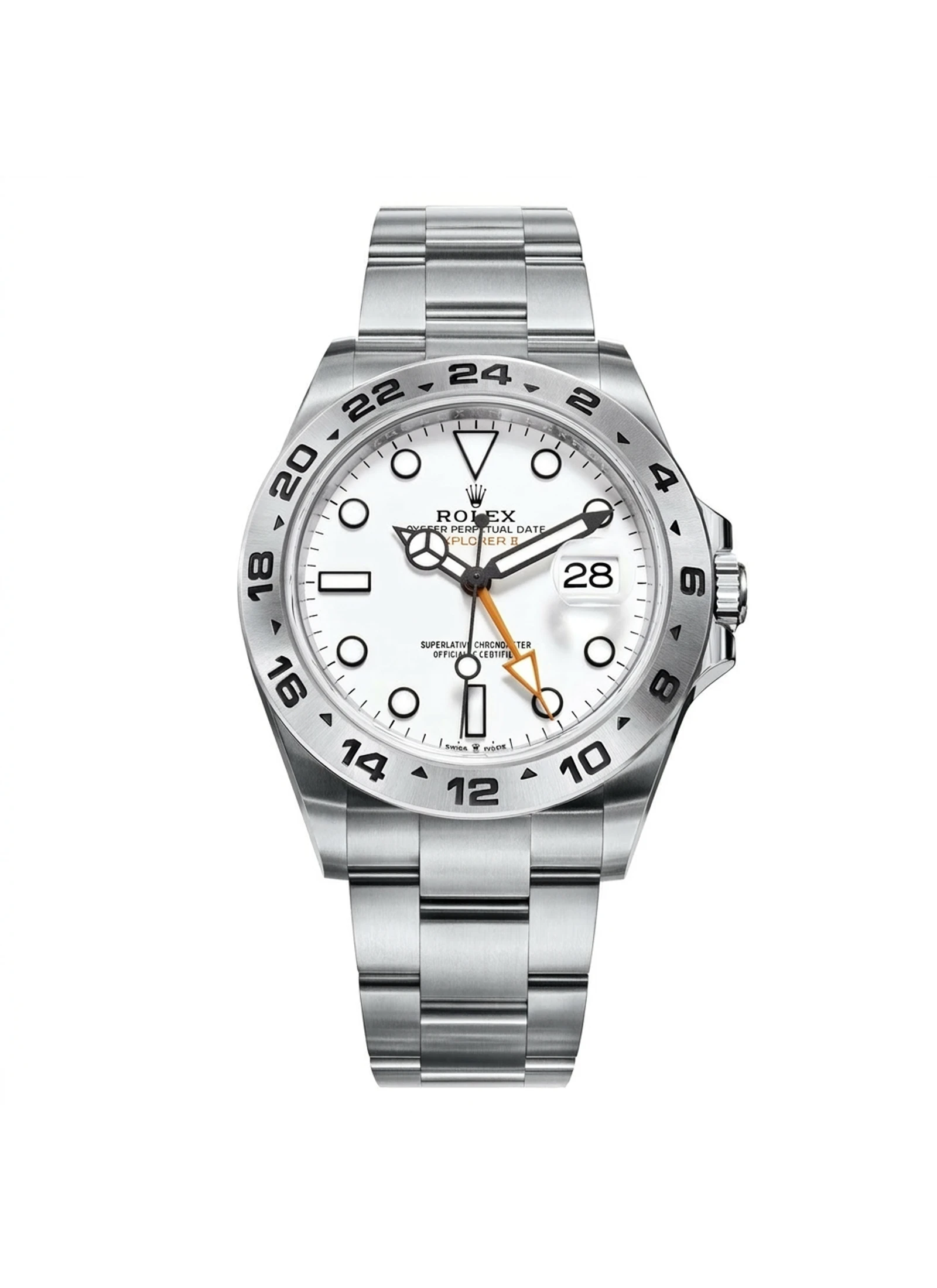
Explorer II matured through the 16570 and 216570. White and black dial options gave it a very different personality from the time-only Explorer, while the orange 24-hour hand and larger 42 mm generation pushed the branch toward a more obvious expedition-tool identity.
The current catalog lets the Explorer idea answer in several voices: 36 mm steel, two-tone 36 mm, a larger 40 mm Explorer, and the 42 mm Explorer II with black or white dial. The split works because the root idea is still legibility under pressure.
Rolex ties the Explorer to the historic 1953 ascent of Everest, and that origin matters because it gives the model its emotional charge. But the Explorer is not interesting only because of a mountain. It is interesting because Rolex translated that expedition aura into one of the simplest durable watch designs in the catalog.
That translation is the key: the Explorer is not a chronograph, dive timer, travel watch, or rotating-bezel instrument. It is a legibility watch. The early references established a black dial, high contrast, and a steel Oyster case as enough.
Mount Everest supplies the Explorer with its founding adventure language, even though the watch's lasting power comes from how simply Rolex translated that myth into a dial. Carsten.nebel / Wikimedia Commons - CC BY-SA 3.0
The Explorer is one of those watches where the dial is the architecture. The 3-6-9 numerals, the triangle at twelve, and the large luminous markers give the watch identity without much decoration. It is a sparse design, but not an empty one.
That restraint explains why the Explorer can survive changes in movement, crystal, bracelet, dial finish, and case size. The grammar is strong enough that a 1016, a 14270, and a 124270 all read as members of the same sentence.
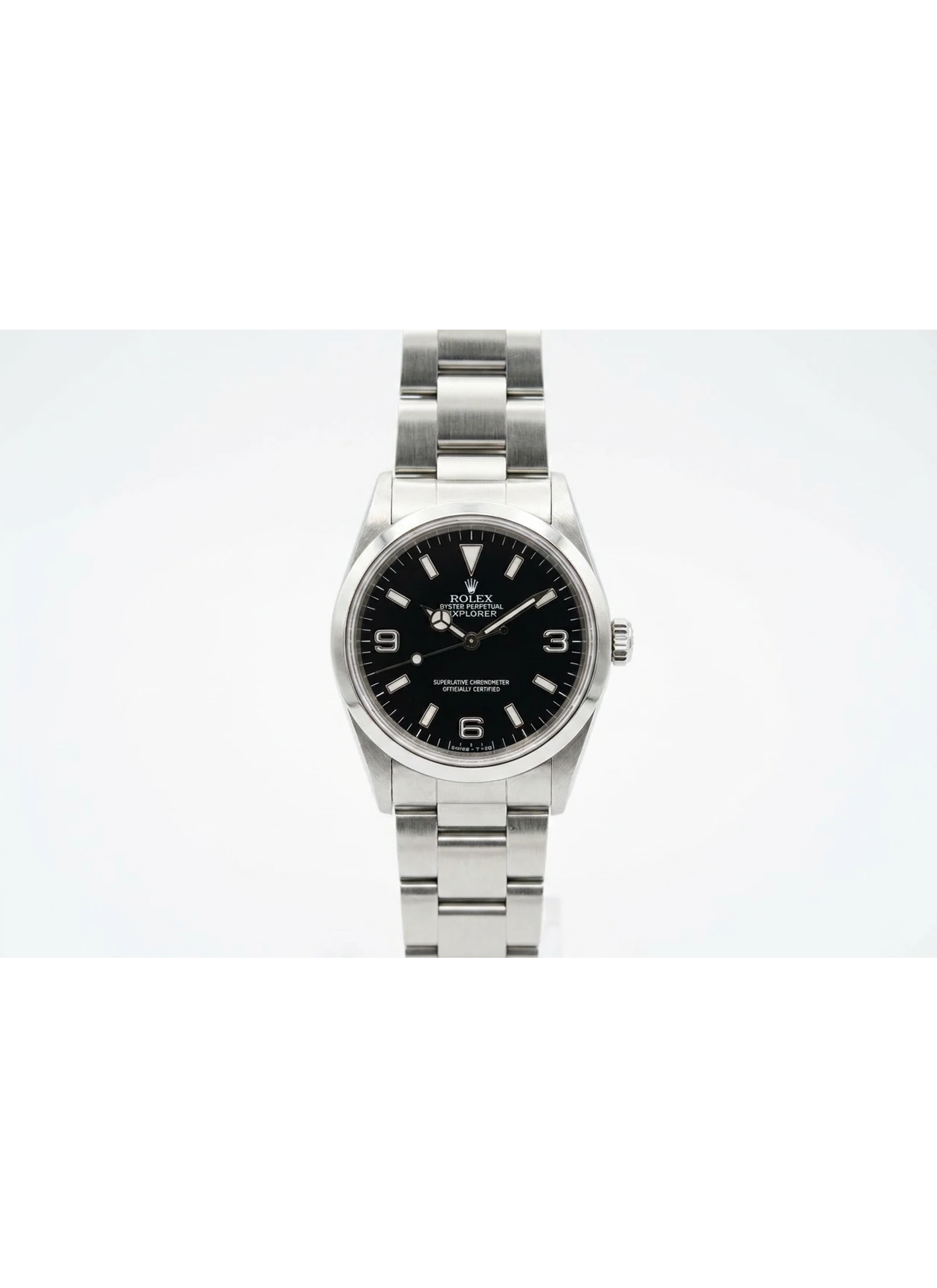
The 1016 is the Explorer that made the model feel inevitable. It ran for decades, stayed compact, and kept the no-date, black-dial format focused. In a brand full of louder icons, the 1016 became the quiet one that collectors return to when they want the essence of a Rolex sports watch.
It also explains why the Explorer is hard to improve. Add too much and it stops being an Explorer. Change too little and it risks feeling static. Rolex has spent much of the model's modern life managing that tension.
A cleared catalog visual of the Explorer 1016 shows the compact no-date format that made the model's restraint collectible.
Explorer II is not simply a bigger Explorer. It solves a different problem: orientation when the outside world stops telling you whether it is day or night. Rolex's own current framing emphasizes the 24-hour display, orange hand, and fixed bezel for caves, polar regions, and other environments where ordinary time markers disappear.
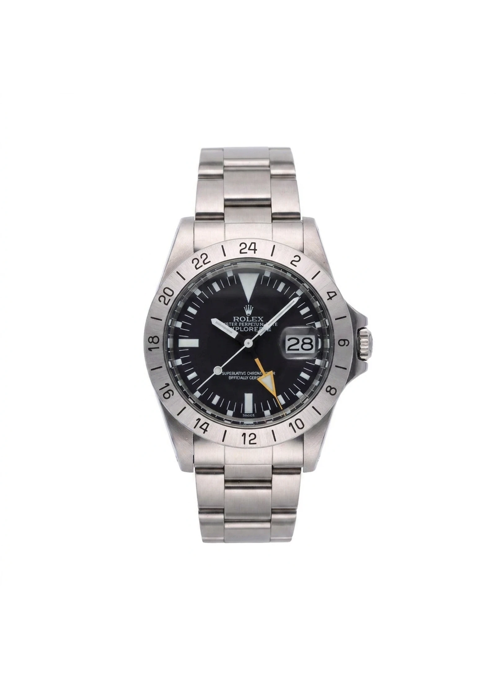
That is why the 1655 looks so different. The dial is busier, the bezel is fixed and numbered, and the extra hand gives the watch a graphic jolt. It is less pure than the Explorer, but more explicit as a tool.
A cleared catalog visual of the Explorer II 1655 shows how the orange 24-hour hand and fixed bezel turned the Explorer idea toward caves and polar timekeeping.
The 14270 made the Explorer modern through materials and finishing rather than through a new concept. Gloss dial, applied surrounds, and sapphire crystal changed the texture, but the watch still behaved like the old Explorer: compact, black-dialed, and direct.
The 214270 later tested a 39 mm Explorer, while the 124270 returned the steel Explorer to 36 mm and the 224270 added a 40 mm option. The debate is useful because it reveals what people want from the watch: enough wrist presence to feel current, but not so much that it loses its quietness.
A cleared catalog visual of the 14270 connects the Explorer's vintage grammar to modern Rolex finishing.
The Explorer remains important because it is one of Rolex's least theatrical Professional watches. Submariner, GMT-Master, Daytona, and Sea-Dweller all announce their functions through bezels or subdials. Explorer is closer to an argument for enoughness.
That does not make it plain. It makes it disciplined. The Explorer family proves that a watch can carry myth, collector history, and modern relevance while still looking like the simplest watch in the room.
A cleared catalog visual of a current white-dial Explorer II shows the modern branch's practical contrast with the time-only Explorer.